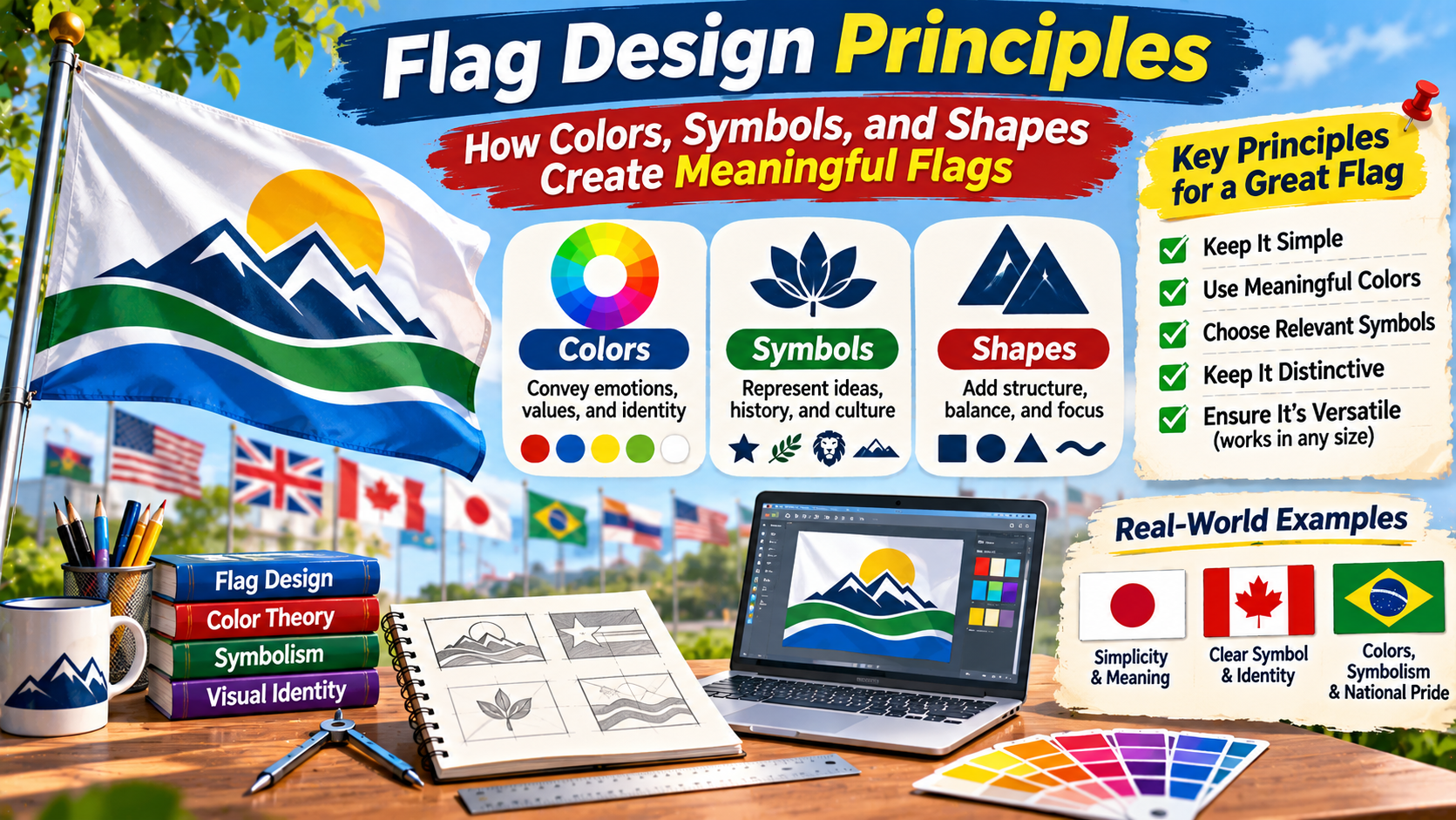
FLAG DESIGN STUDIO / DESIGN FUNDAMENTALS
Small Canvas.
Powerful Identity.
Discover how thoughtful colors, recognizable symbols, balanced proportions, and simple shapes create flags that communicate meaning.
COLOR • SYMBOLISM • GEOMETRY • RECOGNITION
A flag may contain only a few colors and shapes, yet it can represent an entire country, community, organization, or movement.
Some of the world’s most recognizable flags use simple geometric arrangements. Others contain stars, crosses, animals, plants, or detailed historical emblems.
What makes these designs meaningful?
Effective flag design involves more than choosing attractive colors. It requires an understanding of visual communication, cultural symbolism, proportions, and practical use.
A flag may need to remain recognizable when viewed from a distance, displayed on a small screen, printed on fabric, or reproduced in a limited number of colors.
At the same time, its symbols should reflect the identity and values of the people or organization it represents.
This guide explores the essential principles of flag design, explains how colors and shapes influence recognition, and provides a practical process for creating an original flag.
What Is Flag Design?
Flag design is the process of creating a visual symbol intended to represent a country, region, city, institution, community, or other group.
The design may include colors, geometric shapes, stripes, symbols, and distinctive arrangements.
Unlike a poster or illustration, a flag often needs to communicate identity without relying on written explanations.
Its visual elements should work together to create a recognizable composition.
Flag design is closely connected to vexillology, the study of flags, their history, symbolism, and use.
The creative practice of designing flags is sometimes called vexillography.
Understanding both subjects can help designers balance visual clarity with historical and cultural meaning.
Core Design Principle
A flag should be recognizable and meaningful.
The strongest designs balance visual simplicity, practical reproduction, cultural relevance, and a distinctive identity.
The Five Essential Principles of Flag Design
Several widely taught flag design guidelines emphasize simplicity, meaningful symbolism, limited colors, clear lettering-free compositions, and distinctiveness.
These principles are useful starting points, but they are not universal laws.
Many historically important national flags contain details that would be difficult to reproduce from memory.
Historical significance and public recognition can be just as important as graphic simplicity.
1. Keep the Design Simple
A simple flag is generally easier to recognize and reproduce.
Large color areas and uncomplicated shapes remain visible when the flag is viewed from a distance.
For example, Japan’s national flag uses a red circular sun symbol centered on a white background.
The design contains very few elements, making its overall composition immediately recognizable.
However, simplicity should not eliminate symbols that are essential to a flag’s identity.
2. Use Meaningful Symbolism
Colors and symbols can communicate ideas connected to history, geography, culture, or shared values.
A star may represent a political unit, a constellation, or a historical movement.
A plant or animal may reflect regional identity.
For example, Canada’s maple leaf is a recognizable national symbol with a long history of association with the country.
Meaningful symbolism should be researched rather than invented through assumptions about what particular colors always represent.
3. Choose a Manageable Color Palette
Many effective flags use a limited number of colors.
A restrained palette can create stronger contrast and make reproduction easier.
However, there is no fixed number of colors that every flag must follow.
The appropriate palette depends on the design’s symbolism and intended use.
Choose colors that remain distinguishable when displayed together.
4. Avoid Unnecessary Lettering and Tiny Details
Text can become difficult to read when a flag is moving in the wind or viewed from far away.
Small details may also disappear when the design is reduced.
For a new flag, consider whether a recognizable symbol could communicate the same idea more effectively than a written slogan.
However, some existing national flags include important text or detailed emblems for historical and cultural reasons.
Those features should not automatically be considered mistakes.
5. Create a Distinctive Identity
A flag should be distinguishable from other flags likely to appear alongside it.
Similar colors are not necessarily a problem, but an arrangement that closely resembles an existing flag may cause confusion.
Distinctive proportions, symbols, or color placement can help establish a recognizable identity.
How to Choose Colors for a Flag
Color is one of the most important elements in flag design.
It influences recognition, contrast, and visual character.
Colors may also carry cultural or historical meanings.
However, these meanings are not universal.
Red may be connected to courage in one flag and historical political traditions in another.
Green may represent vegetation, religion, or a national movement depending on the context.
Red
Red is visually prominent and appears in numerous national flags.
Its symbolism varies widely, including historical associations with sacrifice, political identity, and military traditions.
Blue
Blue appears in flags associated with different geographic regions and historical traditions.
Its visual strength depends on the shade and surrounding colors.
Green
Green is used in flags connected to religious, cultural, political, and geographic identities.
It can create a strong visual relationship with white, yellow, or other contrasting colors.
Yellow and Gold
Yellow and gold can create strong contrast against dark colors.
They also appear in historical heraldry and numerous national flag traditions.
Black and White
Black and white are useful for creating contrast.
They also carry important historical and cultural meanings in many flags.
When choosing colors, evaluate their appearance together rather than selecting each one independently.
Understanding Color Contrast in Flag Design
Contrast helps different elements remain visually distinct.
For example, a light symbol on a dark background may be easier to recognize than two similar shades placed together.
Traditional heraldry developed conventions that often separated light metallic colors from darker colors.
These conventions influenced many historical flag designs.
Modern designers can apply a similar principle by evaluating whether adjacent colors remain distinguishable.
It is also helpful to test a flag in grayscale.
If important shapes disappear when color is removed, the design may rely heavily on color differences that some viewers cannot easily distinguish.
Grayscale testing is useful, although it does not replace broader accessibility evaluation.
Color Contrast Examples
★
Light on Dark
★
Dark on Light
Choosing Symbols for a Meaningful Flag
Symbols can make a flag distinctive while communicating cultural or historical identity.
However, they should be chosen carefully.
Before using a symbol, research its history and possible interpretations.
A symbol that appears neutral in one context may carry strong political or religious associations elsewhere.
Stars
Stars appear on many national flags.
They may represent political units, national unity, constellations, or historical ideas.
The United States uses 50 stars to represent its states.
Australia’s flag includes stars representing the Southern Cross constellation and the Commonwealth Star.
Crosses
Crosses are common in European flag traditions.
The Nordic cross appears on the flags of Denmark, Sweden, Norway, Finland, and Iceland.
These designs share a recognizable regional structure while using different color combinations.
Animals
Animals can reflect historical heraldry, mythology, or national identity.
Albania’s flag features a double-headed eagle.
Bhutan’s flag contains a dragon associated with the country’s cultural identity.
Plants and Natural Symbols
Plants, trees, mountains, and other natural features may represent geographic or cultural identity.
Canada’s maple leaf and Lebanon’s cedar tree are familiar examples.
Natural symbols can be effective when they have a clear relationship to the community represented.
How Shapes Influence Flag Design
Geometric shapes create structure within a flag.
They can divide the available space, establish balance, and guide attention toward important symbols.
Horizontal Stripes
Horizontal stripes create a layered arrangement.
They are common in national flags because they are relatively straightforward to construct and recognize.
Germany’s flag uses horizontal black, red, and gold bands.
Vertical Stripes
Vertical stripes create a different visual rhythm.
France and Italy both use three vertical bands, although their colors and historical backgrounds differ.
Circles
Circles can create a strong focal point.
Japan’s national flag demonstrates how a single circular symbol can define an entire design.
Triangles and Diagonal Divisions
Triangles and diagonal shapes can introduce movement and visual direction.
They may also provide a distinctive area for a symbol or color.
However, complex divisions should be tested to ensure they remain clear at small sizes.
Understanding Flag Proportions
Flag proportions describe the relationship between height and width.
Many national flags use rectangular formats, but their dimensions are not identical.
Common examples include ratios such as 2:3, 3:5, and 1:2.
These ratios express the height relative to the width.
For example, a flag with a 2:3 ratio has a height of two units for every three units of width.
Proportions influence how symbols and color divisions fit within the available space.
When designing a new flag, select a ratio before refining the layout.
This helps prevent unexpected stretching or distortion.
| Aspect Ratio | Example Dimensions | Visual Character |
|---|---|---|
| 2:3 | 200 × 300 units | Moderately wide rectangle |
| 3:5 | 300 × 500 units | Slightly wider proportion |
| 1:2 | 200 × 400 units | Long horizontal rectangle |
When reproducing an existing national flag, always use its officially specified proportions rather than selecting an arbitrary ratio.
What Famous National Flags Teach Us About Design
Studying existing flags can help designers understand how visual decisions work in practice.
Japan: Simplicity and Focus
Japan’s flag uses a red sun disc against a white background.
Its limited elements create a clear visual focus.
The design demonstrates how a single symbol can establish a recognizable identity.
Canada: Distinctive National Symbolism
Canada’s flag uses a stylized maple leaf within a red-and-white composition.
It demonstrates how a familiar national symbol can become the central feature of a design.
United Kingdom: Historical Layering
The Union Flag combines crosses associated with different historical traditions.
Its design illustrates how several symbolic elements can be integrated into one composition.
South Africa: A Flag Marking Political Change
South Africa adopted its current national flag in 1994 during the transition to democracy.
The design is notable for its distinctive arrangement of multiple colors.
It demonstrates how a flag can become closely associated with an important historical transition.
Bhutan: Cultural Detail and Identity
Bhutan’s flag features a dragon across a diagonally divided field.
Its detailed central symbol demonstrates that a meaningful flag does not always follow minimalist design conventions.
How to Design Your Own Flag: Step by Step
Creating an original flag is an excellent exercise in visual communication.
The process can be completed using pencil and paper or digital design software.
STEP 01
Define the Identity
Decide what the flag will represent. Write down the most important values, historical connections, or geographic characteristics.
STEP 02
Research Existing Flags
Study flags with similar cultural or regional backgrounds. Identify common symbols and avoid creating an unnecessarily confusing resemblance.
STEP 03
Sketch Several Concepts
Create multiple small sketches using simple geometric arrangements. Explore different layouts before choosing one.
STEP 04
Choose Colors and Symbols
Select a manageable palette and symbols that have clear relevance to the intended identity.
STEP 05
Set the Proportions
Choose the flag’s dimensions and arrange the elements consistently within that space.
STEP 06
Test Recognition
View the design at small sizes, from a distance, and in grayscale. Check whether the major shapes remain identifiable.
STEP 07
Refine the Final Design
Remove unnecessary details, improve alignment, and confirm that the symbols and colors communicate the intended meaning.
Common Flag Design Mistakes
Beginners sometimes focus on adding visual details rather than creating a clear overall composition.
This can result in a design that looks attractive at full size but becomes difficult to recognize when reduced.
Common mistakes include:
- Using too many unrelated colors.
- Adding tiny symbols that disappear at small sizes.
- Including unnecessary text or slogans.
- Choosing symbols without researching their cultural meaning.
- Using colors with insufficient visual distinction.
- Ignoring the intended flag proportions.
- Creating a design that closely resembles an existing flag without a clear reason.
- Failing to test how the flag looks when reproduced on fabric or digital screens.
These issues can often be improved by simplifying the composition and testing it in realistic situations.
Digital Tools for Creating Flag Designs
Digital design software can help create precise shapes, consistent colors, and scalable artwork.
Vector graphics are particularly useful because they can be resized without the same loss of sharpness associated with low-resolution raster images.
When creating a flag digitally, begin with a canvas that matches the intended aspect ratio.
Use simple shapes and consistent alignment.
Save an editable version of the design so colors and proportions can be adjusted later.
For web use, SVG can be a useful format for scalable flag artwork.
PNG files are also suitable when a raster image is required.
Before distributing a design, check whether it includes protected symbols, organizational emblems, or other elements with legal restrictions.
Frequently Asked Questions About Flag Design
What makes a good flag design?
A good flag design balances recognition, meaningful symbolism, clear composition, and practical reproduction. Historical and cultural context also matter.
How many colors should a flag have?
Many effective flags use a limited palette, but there is no universal rule. Choose enough colors to communicate the intended identity without unnecessary complexity.
Should a flag include text?
For a new design, avoiding unnecessary text can improve recognition at a distance. However, some established flags contain historically significant lettering.
What is the best shape for a flag?
Rectangular flags are common, but proportions vary. The appropriate shape depends on the flag’s purpose and any applicable official requirements.
Can I design a flag using simple shapes?
Yes. Stripes, circles, triangles, and other geometric forms can create distinctive and meaningful designs.
What is vexillography?
Vexillography is the practice of designing flags. It is related to vexillology, the study of flags.
Why do some national flags have complex symbols?
Complex symbols may preserve important historical, religious, political, or cultural traditions that remain central to national identity.
Final Thoughts
Flag design combines visual communication with history, culture, and identity.
Colors establish the overall character of a design.
Symbols connect it to ideas, traditions, or historical experiences.
Shapes and proportions organize those elements into a recognizable composition.
Although simplicity is a useful design principle, it should not replace meaningful cultural or historical symbolism.
The most effective approach is to understand the identity being represented, explore several concepts, and test the final design in realistic conditions.
Whether you are creating a flag for a community, an educational project, or a fictional country, thoughtful decisions about color, symbolism, and structure can make the result more memorable.
A successful flag does not need to contain many elements. It needs a clear purpose and a visual identity that supports that purpose.
The Flag Design Formula
Meaningful Symbols + Clear Colors + Balanced Shapes = A Recognizable Flag
Great flag design begins with understanding what the flag represents and finding a clear visual way to communicate that identity.