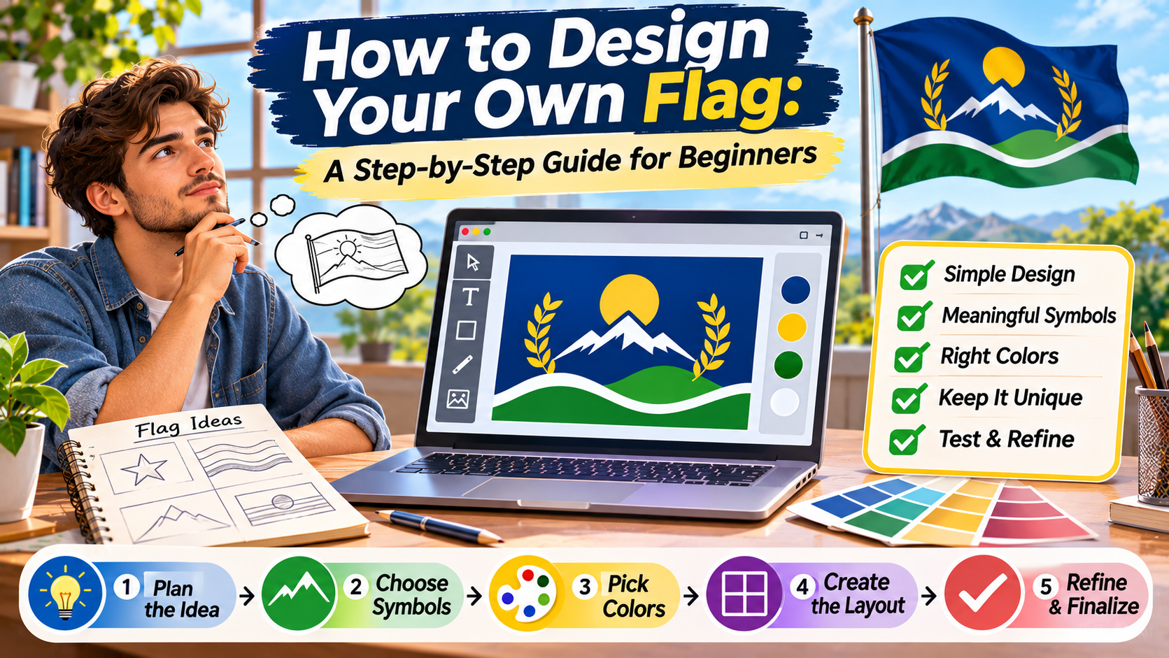
THE CREATIVE FLAG WORKSHOP
Design a Flag That Tells Your Story.
A practical beginner’s guide to creating original flags using meaningful symbols, thoughtful colors, balanced layouts, and simple design techniques.
PLAN → SKETCH → DESIGN → TEST → REFINE
Designing your own flag is an opportunity to turn ideas, values, and identity into a recognizable visual symbol.
A flag can represent a community, school, club, organization, fictional country, family project, or creative concept.
Although flags often appear simple, creating an effective design requires careful thought.
Every color, shape, and symbol contributes to the overall message.
A design that looks attractive on a computer screen may become difficult to recognize when reduced to a small image or displayed on fabric.
Likewise, a visually impressive symbol may not communicate the intended meaning if its cultural or historical background is misunderstood.
The goal is to create a flag that is visually clear, meaningful, and suitable for its intended purpose.
This step-by-step guide explains how beginners can plan, sketch, design, and refine an original flag without needing advanced graphic design experience.
What Makes a Flag Design Effective?
An effective flag communicates identity through a recognizable arrangement of visual elements.
It should work as a complete composition rather than a collection of unrelated decorations.
For many new flag projects, a simple design is easier to reproduce and recognize.
However, simplicity is not the only consideration.
Some established national flags contain complex historical symbols that are central to their identity.
When designing a new flag, consider four important qualities:
- Meaning: The design should represent the intended community or idea.
- Recognition: Important shapes should remain identifiable at different sizes.
- Balance: Colors and symbols should work together visually.
- Practicality: The flag should be suitable for printing, display, and digital use.
Design Principle
Start with meaning before choosing colors.
A clear understanding of what your flag represents makes later design decisions easier and more consistent.
Step 1: Decide What Your Flag Will Represent
Before drawing anything, define the purpose of your flag.
Is it intended for a local community, a student project, a sports club, or a fictional nation?
Different purposes may require different visual approaches.
A community flag might emphasize geography or local heritage.
A school flag might represent learning, cooperation, or institutional history.
A fictional country’s flag might reflect an imagined culture, political system, or historical background.
Write down three to five ideas that best describe the identity you want to communicate.
For example, a fictional coastal community might choose:
- Connection to the sea.
- Environmental responsibility.
- Community cooperation.
- Historical maritime traditions.
These ideas can guide the selection of colors, shapes, and symbols.
Step 2: Research Existing Flag Designs
Studying existing flags can help you understand how designers use limited visual elements to communicate identity.
Look at flags from different countries, cities, regions, and organizations.
Observe their color arrangements, symbols, and proportions.
For example, Japan’s national flag demonstrates how one central symbol can create a recognizable design.
Canada’s flag shows how a familiar national symbol can become the main visual feature.
Denmark’s flag illustrates the long history of the Nordic cross tradition.
These examples provide useful lessons, but your goal should be to create an original design rather than copy an existing flag.
Research is also important when selecting cultural or religious symbols.
A symbol may have meanings that are not immediately obvious.
Understanding its background can help you avoid accidental misrepresentation.
Step 3: Choose the Right Flag Shape and Proportions
Most flags use rectangular shapes, although their proportions vary.
The aspect ratio describes the relationship between the flag’s height and width.
For example, a 2:3 flag has a height of two units for every three units of width.
Common rectangular proportions include 2:3, 3:5, and 1:2.
These are examples rather than universal requirements.
For a beginner project, selecting a standard rectangular format makes planning easier.
Choose the aspect ratio before drawing detailed elements.
This helps ensure that symbols and color divisions fit the intended space.
| Ratio | Example Size | Appearance |
|---|---|---|
| 2:3 | 600 × 900 px | Balanced rectangular format |
| 3:5 | 600 × 1000 px | Slightly wider layout |
| 1:2 | 600 × 1200 px | Long horizontal layout |
For an official national or regional flag, use the legally or formally specified dimensions instead of selecting your own.
Step 4: Select Meaningful Colors
Color is one of the first things people notice about a flag.
It influences visual character, recognition, and contrast.
Colors can also carry cultural or historical meaning.
However, the meaning of a color depends on context.
Green may represent nature in one design and religious or political traditions in another.
Red may reflect historical identity, courage, or other ideas depending on the flag.
For your own design, decide what each color represents and whether those meanings are appropriate.
Use a Limited Palette
Beginners often find it easier to work with two or three main colors.
This is not a strict rule, but a limited palette can reduce unnecessary complexity.
Choose colors that remain visually distinct when placed together.
Consider Contrast
Light and dark colors can create strong visual separation.
For example, white against dark blue is generally easier to distinguish than two similar shades of blue.
Test your design in grayscale to see whether important shapes remain visible.
Also consider how people with different forms of color vision may perceive the design.
Step 5: Choose a Symbol That Supports the Meaning
Not every flag needs a central symbol.
Some effective designs rely entirely on colors and geometric divisions.
However, a meaningful symbol can make a flag more distinctive.
Common choices include stars, circles, trees, mountains, animals, and geometric shapes.
For a fictional coastal community, a simplified wave might represent its connection to the sea.
A tree could represent local forests or environmental values.
A star might represent unity or a shared goal, provided that interpretation is clearly established for the design.
Avoid adding symbols only because they look decorative.
Each major element should contribute to the intended identity.
Symbol Selection Exercise
Ask three questions before adding a symbol.
- Does it represent something important?
- Can people recognize it at a small size?
- Could it be misunderstood in the intended cultural context?
Step 6: Create Several Rough Sketches
Do not begin by perfecting your first idea.
Instead, create several small sketches.
Try different arrangements of the same colors and symbols.
One design might use horizontal stripes.
Another might feature a central circle.
A third could use a diagonal division.
Small sketches make it easier to compare overall compositions without becoming distracted by details.
At this stage, focus on the arrangement of large shapes.
You can refine the final proportions later.
Three Beginner-Friendly Layout Ideas
Horizontal Division
Vertical Division
Diagonal Division
These illustrations are original practice concepts, not representations of official national flags.
Step 7: Arrange the Elements Carefully
Once you choose a promising sketch, refine the placement of each element.
Consider the relationship between positive space and negative space.
Positive space includes the visible shapes and symbols.
Negative space is the empty area surrounding them.
A flag with too many competing elements may feel crowded.
One with very small symbols may appear empty or disconnected.
Use alignment and consistent proportions to create a balanced composition.
If a central symbol is included, make sure it has enough space to remain recognizable.
Balance does not always require perfect symmetry.
Asymmetrical designs can work effectively when their elements are arranged intentionally.
Step 8: Test Your Flag at Different Sizes
A flag should be evaluated beyond the size at which it was originally designed.
Reduce the design to a small thumbnail.
Check whether the major shapes remain visible.
Next, view it from a distance.
Ask whether its overall arrangement is still recognizable.
You can also print a small version to evaluate color separation and detail.
For digital designs, inspect the flag on both large and small screens.
These tests may reveal details that need to be simplified or enlarged.
Step 9: Create a Digital Version
Once the sketch is refined, you can recreate the flag digitally.
Vector design software is particularly useful for geometric flag artwork.
Vector graphics can be scaled without the same loss of sharpness associated with low-resolution raster images.
Begin by creating a canvas with the chosen aspect ratio.
Draw the main color divisions first.
Then add symbols and adjust their placement.
Use consistent colors and avoid unnecessary effects that may complicate reproduction.
For a web-ready version, SVG is useful for scalable graphics.
PNG can be suitable for sharing or displaying raster versions.
Keep an editable master file so you can make adjustments later.
Step 10: Review and Refine the Final Design
Before finalizing your flag, compare it with your original goals.
Does it communicate the intended identity?
Are the colors and symbols meaningful?
Can the design be recognized at a distance?
Does it resemble another flag too closely?
Are any elements unnecessarily complicated?
Consider showing the design to a few people and asking what they notice first.
Their observations can reveal whether the main symbol and color arrangement communicate clearly.
Feedback is especially valuable when the flag is intended to represent a real community.
People connected to that community may identify historical or cultural issues that are not obvious to the designer.
Common Mistakes When Designing a Flag
Beginners sometimes make their designs more complicated than necessary.
Adding extra colors, symbols, and text may seem creative, but it can weaken recognition.
Other common mistakes include:
- Starting without defining what the flag represents.
- Choosing colors only because they look attractive.
- Using symbols without understanding their meaning.
- Including tiny details that disappear at small sizes.
- Ignoring contrast between adjacent colors.
- Changing proportions after the layout is complete.
- Copying an existing flag too closely.
- Skipping feedback and practical testing.
Most of these problems can be addressed through better planning and a few additional rounds of refinement.
A Practical Example: Designing a Fictional Community Flag
Imagine you are creating a flag for a fictional town called Greenhaven.
The community values forests, cooperation, and its connection to a nearby river.
You begin by choosing three design ideas:
- Green to represent the town’s forests.
- White to create contrast and suggest openness.
- A simple blue wave to represent the river.
Next, you sketch several layouts.
One version uses horizontal stripes.
Another places the wave inside a central circle.
A third combines a green field with a white diagonal band.
After comparing the sketches, you select the arrangement that remains easiest to recognize at a small size.
You then refine the wave symbol and test the design in grayscale.
The final result is a flag with a clear relationship between its visual elements and the fictional community’s identity.
This example illustrates how meaning can guide design decisions from beginning to end.
Frequently Asked Questions
Can beginners design their own flags?
Yes. Beginners can create effective flag concepts using simple shapes, meaningful colors, and basic drawing or digital design tools.
What is the easiest way to start designing a flag?
Begin by defining what the flag represents. Then sketch several simple layouts before choosing colors and symbols.
How many colors should I use?
Two or three main colors can be a useful starting point, but the appropriate number depends on the design’s purpose and symbolism.
Does every flag need a symbol?
No. Some flags rely entirely on geometric divisions and color arrangements.
What software can I use to design a flag?
Vector graphics editors and general design applications can be used to create flag artwork. Pencil and paper are also effective for early sketches.
What is the best aspect ratio for a flag?
There is no universal best ratio. Common rectangular formats include 2:3, 3:5, and 1:2. Choose one that suits the intended purpose.
How do I know whether my flag design works?
Test it at different sizes, check its contrast, compare it with existing flags, and gather feedback from people familiar with the intended identity.
Final Thoughts
Designing your own flag is a creative process that combines research, symbolism, and visual communication.
The most useful starting point is a clear understanding of what the flag should represent.
From there, you can explore colors, shapes, symbols, and proportions that support the intended identity.
Sketching multiple concepts helps you compare different approaches before investing time in detailed artwork.
Testing the design at different sizes can reveal problems with contrast, balance, or unnecessary complexity.
Finally, thoughtful refinement can turn a rough concept into a recognizable and meaningful symbol.
Whether your project is educational, fictional, or community-focused, the same principles can help you create a flag with a clear purpose.
Your Flag Design Checklist
Define. Research. Sketch. Simplify. Test. Refine.
A memorable flag begins with a meaningful idea and develops through careful visual decisions.